Color
Core Color Palette
Boldly Blue.
The SAS Core Palette embraces our history and creates a canvas for an even brighter future. The foundation of our visual brand, the core colors deliver distinctive and consistent visuals throughout the customer journey.
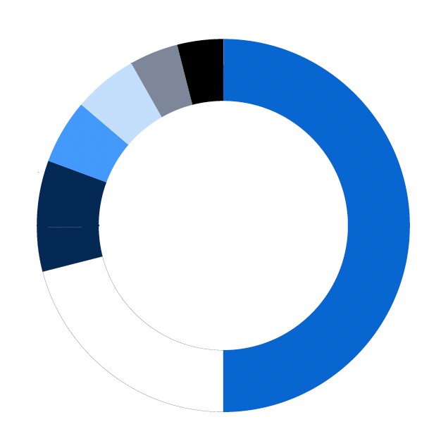
SAS Blue serves as the primary color across all SAS experiences. Additional colors are used sparingly and purposefully.
Every visual experience is grounded in ample whitespace, allowing SAS Blue and secondary colors to offer contrast and sophistication.

SAS Blue
HEX #0766D1
R7 G102 B209
C90 M48 Y0 K0
PMS 285
Secondary Group

Midnight Blue
HEX #032954
R3 G41 B84
C100 M69 Y8 K54
PMS 295

Medium Blue
HEX #4398F9
R67 G152 B249
C56 M32 YO KO

Light Blue
HEX #C4DEFD
R196 G222 B253
C22 M8 Y0 K0
Neutral Group

Black
HEX #000000
R0 G0 B0
C60 M40 Y40 K100
PMS BLACK 3

Slate
HEX #7E889A
R126 G136 B154
C35 M14 Y11 K35
PMS 7544

White
HEX #FFFFFF
R255 G255 B255
C0 M0 Y0 K0
Color Proportions
The proportions displayed below represent the priority that should be given to specific colors within palettes, not the absolute measures of each color within a composition.
PRIMARY COLOR PALETTE

SAS® VIYA® PALETTE

ACCENT COLORS

Accent Colors
Used solely in conjunction with our Core Palette, Accent Colors can be utilized to evoke emotion and enrich storytelling. They are primarily used in campaigns, events, imagery and presentations. Each Accent Color group is defined by three shades of a single hue to allow dimension. The four colors: yellow, red, teal and green are always used as accents within the context of the Core Palette.
Optimized for a digital experience, we recognize that maintaining the vibrancy of our colors is not always possible in printed materials. To ensure the essence of the brand endures, consider adjusting the proportions of the colors to maintain the energy of the brand’s personality.
When incorporating Accent Colors, our work should always be representative of the SAS brand. Start with the following principles:
Lead with white space. Whitespace isn’t always white. Use negative space thoughtfully and avoid cluttering compositions with excessive design elements.
SAS Blue should be the commanding color. The Core Palette should be the foundation of every composition.
Limit accents to one Accent Color group. To preserve the influence of our Core Palette, avoid incorporating Accent Colors from more than one group.
Yellow Group

Deep Yellow
HEX #D9A30B
R217 G163 B11
C3 M28 Y97 K9

Yellow
HEX #FFCC33
R255 G204 B51
C1 M16 Y83 K1

Light Yellow
HEX #FFDF73
R255 G223 B115
C2 M9 Y63 K1
Teal Group

Deep Teal
HEX #06C1CC
R6 G193 B204
C65 M1 Y17 K0

Teal
HEX #3ADBE6
R58 G219 B230
C48 M0 Y12 K0

Light Teal
HEX #79E8F2
R121 G232 B242
C37 M0 Y8 K0
Red Group

Deep Red
HEX #CC2D2D
R204 G45 B45
C3 M91 Y86 K6

Red
HEX #F24949
R242 G73 B73
C0 M80 Y66 K0

Light Red
HEX #FF9999
R255 G153 B13
C0 M44 Y24 K0
Green Group

Deep Green
HEX #29B869
R41 G184 B105
C68 M0 Y73 K0

Green
HEX #36D982
R54 G217 B130
C50 M0 Y50 K0

Light Green
HEX #79F2AF
R121 G242 B175
C35 M0 Y31 K0
SAS® Viya® Color Palette
The Viya Color Palette is grounded in SAS Blue.
To differentiate the promotion of SAS Viya, accents of Viya Pink are always included to reflect the dynamic insights garnered from the product. As with applying the Core Palette, every visual experience embraces ample whitespace, to create contrast and uncluttered sophistication. Colors from the SAS Viya Pink Group are never incorporated in compositions that include Accent Colors.
PRIMARY COLOR

SAS Blue
HEX #0766D1
R7 G102 B209
C90 M48 Y0 K0
PMS 285
SECONDARY GROUP

Midnight Blue
HEX #032954
R3 G41 B84
C100 M69 Y8 K54
PMS 295

Medium Blue
HEX #4398F9
R67 G152 B249
C56 M32 YO KO

Light Blue
HEX #C4DEFD
R196 G222 B253
C22 M8 Y0 K0
NEUTRAL GROUP

Black
HEX #000000
R0 G0 B0
C60 M40 Y40 K100
PMS BLACK 3

Slate
HEX #7E889A
R126 G136 B154
C35 M14 Y11 K35
PMS 7544

White
HEX #FFFFFF
R255 G255 B255
C0 M0 Y0 K0
VIYA GROUP

Dark Viya Pink
HEX #850D4A
R133 G13 B74
C18 M95 Y22 K32

Viya Pink
HEX #DB127D
R219 G18 B125
C9 M100 Y14 K0
PMS 219

Light Viya Pink
HEX #FF66B2
R255 G102 B178
C5 M62 Y2 K0