Graphic Elements
Through the consistent and intentional application of graphic elements, we’re able to establish hierarchy, direct interaction and deliver delight – while reinforcing our brand.
Brand Shape Language
Our core shape language empowers the construction of consistent visual experiences. When applied to a grid-based foundation, we’re able to establish hierarchy, direct interaction and deliver delight – while reinforcing our brand.
The SAS Brand Shape language features rounded edges for fluid, dynamic designs. The curved edges are human and recall the shape of our S-mark.
By combining and arranging shapes in precise and bold ways, we’re able to create relevant visuals that enhance the stories we share.
CIRCLE
SEMICIRCLE
QUADRANT
BLADE
BAR
DROP
Working with Shapes on a Grid
All shape compositions are developed on a 1x1 grid to ensure precision placement and a well-structured design.
Regardless of the core shapes used, aligning and sizing them based on the underlying grid will create uniformity and continuity between design compositions.
To foster the clarity we wish to convey in our visuals, all elements — including shape compositons, photography, icons, illustrations, text and our logo — much be placed with purpose and intention.
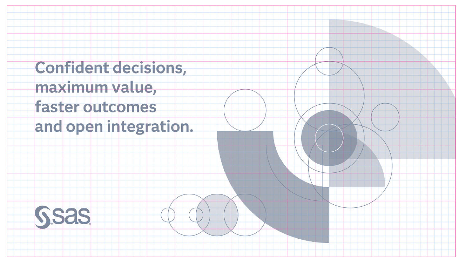
Rules for Working with Shapes
While solid shapes are favored to embrace our philosophy of being bold, transparency can be used to communicate meaning such as transition or speed.
Shapes may be overlapped or combined to create composite shapes to indicate complexity, motion or speed. Embrace opportunities to overlap solid shapes to establish whitespace.

Strokes may be applied to unfilled shapes, if essential to the visual story or to emphasize filled shapes. The stroke weight should be the minimal weight needed for clearly communicating intent and should be relative to the final display size.
Shape compositions may be rotated on a 45-degree angle to direct the eye and imply motion.
All compositions should include a circle, to reference our foundational form.

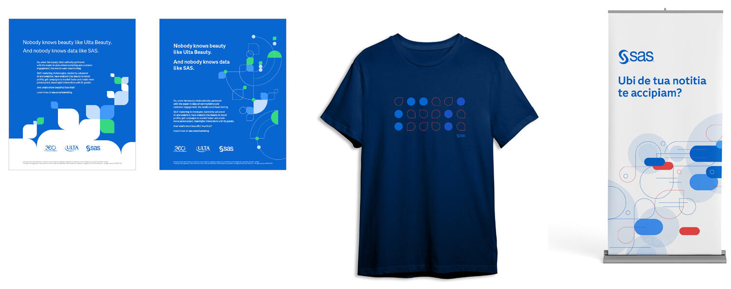
Shape Composition Examples (Core Brand)
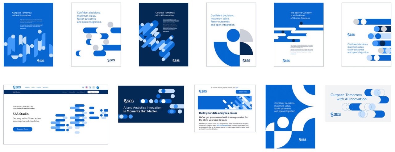
Shape Composition Examples (Accent Color)
SAS® Viya® Shape Language
The Viya shapes are intentional selections from our core shape language. Often, these shapes are assigned specific meaning in the story of our technology. Because the SAS Viya identity utilizes shapes from the SAS core brand, there is a natural transition from the core brand to Viya experiences.
The SAS Pink Square is a distinctive brand asset that represents the powerful insights SAS technology provides our customers. Together, these shapes can be used to reflect the process of turning data into an impactful decision.
Exclusive to the Viya identity, the pink square should be incorporated into all SAS Viya promotions specific to the technology. It’s essential that only one pink square be incorporated in any composition.
CIRCLE
BAR
SQUARE
Shape Compositions for SAS® Viya®
All SAS Viya visualizations should support the messsage that our technology takes users from a billion points of data to a single point of view.
Shape compositions should create a sense of movement and speed, and reflect the process of information, represented by circles, flowing into the destinaton, which is designated by a single pink square.
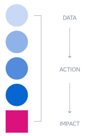
Shape Composition Examples (SAS® Viya®)
When compared to core brand application, the scale of the shapes used in SAS Viya compostions is smaller, allowing for more intricate storytelling and symbolizing the technical complexity of our users’ environments. Line work may be incorporated to depict complex models.
As the culmination point of the visual story, the pink square should never be obscured or be the smallest shape in the composition.

Photography
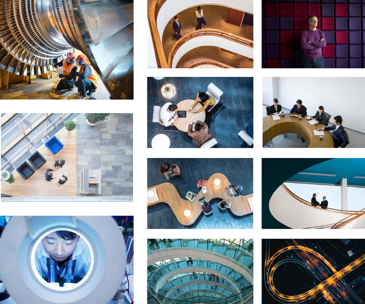
Still photography shows our human side. It allows us to embrace and represent the diverse world of SAS. Whether we want to represent people, places or things, we are always striving to create an emotional connection with empathy, innovation and optimism. Photography can also bring consistency to our brand material and give a premium feel to our work.
Situational Photography
Productivity, product results, human connection, teamwork
Photographs that depict real-life situations where people are interacting with our software should appear believable and realistic. Look for pictures where faces are highlighted and well-lit. We want to convey the message that SAS is fast, flexible and facilitates productivity.
Style
Gritty and Natural situations, Candid, Natural-looking people whose expressions look real, not staged models. Unusual Crops, Strong Geometric composition, Interesting angles and perspectives, Demonstrating productivity
Color
Warm, rich colors
Settings
Believable and realistic
Sources
SAS DAM: https://dam.sas.orangelogic.com
Original Art Direction
Environmental Photography
Data representation, world impact, business outcome
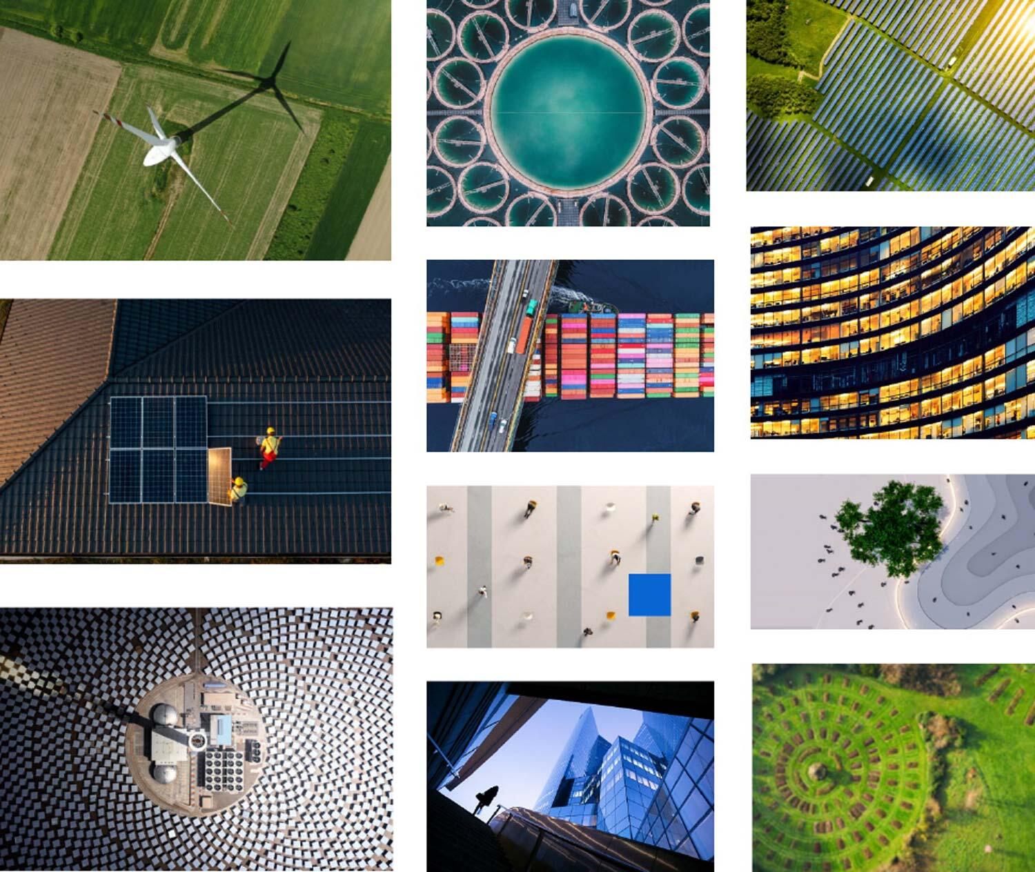
We choose environmental, landscape and cityscape images that are unique, stunning in their beauty or unusual in composition. These pictures may or may not feature people. In most cases, these images will hint at representing data or data results.
Style
Bird’s Eye Views, Unique angles, unique/interesting visual perspectives. Unusual compositions, conveys geometric feel
Color
Rich, full color
Settings
Architectural, natural landscapes, industrial landscapes, cityscapes
Sources
SAS DAM: https://dam.sas.orangelogic.com
Original Art Direction
Portraits
Thought leadership, partnerships, human connection, success stories
We have many needs for portraits, whether showing SAS employees, event speakers, etc.
Style
Shallow depth of field, composition to be top of head to either top of torso or midway down torso, shot straight on or three-quarter turn, may be shot at unique angles, highlights unique personality, created to be displayed off center, in a circle.
Color
Rich full color
Settings
Any environment
Recommended Usage
Leadership, promotional, customer quotes & testimonials
Sources
SAS DAM: https://dam.sas.orangelogic.com
Original Art Direction

Photo Illustration
Playful, immersive, brand connection & integration
We have many needs for portraits, whether showing SAS employees, event speakers, etc.
Style
Photo Illustration is a great way to make a unique statement. By using photography mixed with brand shape language, it is possible to convey a message that is more engaging than either art style alone.
Note: when using crops of people always ensure parts of original environment are visible and integrated with graphic elements
Color
Rich, full color imagery mixed with shapes using core brand color palette (Accent colors may be used in select instances)
Settings
Architectural, natural landscapes, industrial landscapes, cityscapes
Sources
SAS DAM: https://dam.sas.orangelogic.com
Original Art Direction

Icons
Icons serve as visual cues that simplify communication, guide users, and improve recognition through consistent and purposeful design. These guidelines provide a unified framework for iconography, ensuring a consistent presentation and semiotic language across the brand globally.
The icon guideline and PowerPoint icon library are available for download.
For information about using icons in presentations and to access corporate PowerPoint templates, refer to the Presentations page.
The Adobe Illustrator file is available to designers here: SAS Icon Master

SAS Illustrations
Sometimes a photograph doesn’t quite articulate the message. That’s where illustration comes in. We use a range of illustrated graphic concepts to communicate SAS values – and the personality and emotion that are endemic to our brand. With color, texture and shape we create curiosity, a feeling of promise and positivity that shows who we are.
As we continue to develop our brand illustration strategy, carefully selected stock illustrations are permitted.
Source stock illustrations from either Getty or Adobe Stock. Please complete the Stock Asset Request form to acquire the selected asset.
You may also find illustration assets in the SAS DAM, but be aware that their application comply with the following guidelines.
To prevent request rejections, ensure the selected assets meet the following criteria before submitting the request:
- Flat illustrations should be clean and elegantly composed with a clear hierarchy. It is most effective when the visual storytelling and messaging complements each other.
- Only license assets that are available as vector. Before being used in a composition, they must be recolored to comply with the SAS Brand color guidelines. Tints and shades of the brand colors are permitted to achieve depth and clarity.
- If an illustration has shading, it should reflect a consistent light source using flat color and not smooth gradients or soft transitions.
- When combining different assets, ensure the style is consistent. Shading, perspective and character proportions should be consistent across the entire illustration.
- Utilizing the SAS Shape Language helps to increase alignment with the SAS Brand. A simple way to achieve this result is to use a shape as a background to frame the subject(s).
- People should be represented without facial features, realistically proportioned, and not overly stylized to avoid creating a ‘cartoon-like’ appearence. Realistic skin tones should be used when representing people.
- Attire, locations and objects should feel modern and professional, portrayed in a realistic or semi-abstracted style.
Please examine the examples provided to see how illustrations should be modified to fit the SAS Brand.