SAS Custom Font – Anova and Anova UI
Updated November 2025
The SAS Font
SAS commissioned a custom SAS font, Anova, which was released in 2023 that is used exclusively for SAS. The Anova font is currently used in content, promotional assets, websites and in our SAS software. There are two Anova families:
- Anova: our primary typeface used for most use cases such as marketing assets, web, documents and for large font size use cases such as on larger screens on stage at events or booths.
- Anova UI family: created to be optimized for smaller font sizes, specifically for SAS visualizations in-product when micro-sized font is required.
Anova supports over 200 languages covering North and South America, Europe and Africa. Anova fonts also include Greek and Cyrillic scripts, Belarusian, Bulgarian, Greek, Macedonian, Russian, Serbian and Ukrainian.
Available weights: Light, Light Italic, Regular, Regular Italic, Bold and Bold Italic
Alternative typeface
When a system font is required or Anova is not available, we deploy Arial. Current uses include emails and Microsoft Office applications, excluding PowerPoint.
Meet Anova
We believe curiosity is at the heart of human progress.
AaBbCcDdEeFfGgHhIiJjKkLlMmNnOoPpQqRrSsTtUuVvWwXxYyZz 0123456789!@#$%^&*()_+{}|:”<>?
Margins and Spacing
HEADLIINES
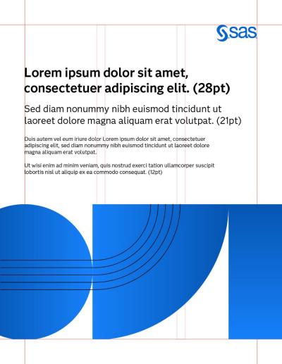
Use Anova Bold in sentence case for most applications. The tracking should be set to 0. All headlines should be set left-justified, ragged right and the leading should be 120% of the type point size.
SUBHEADS
Subheads are set in Anova Regular. A typical calculation of the text point size is a ratio of .75x of the headline size.
MARGINS
Margins should be .75” and equal on all sides whenever possible
Requesting Anova
Agencies: Approved agencies can request Anova from their SAS employee contact.
SAS employee: If Anova is required, you can easily access and download the files.